Case Study
AMPLIFIED PLANNING VISUAL IDENTITY REFRESH
+ WEBSITE REDESIGN
From youthful and informal to multigenerational and playful.
When Amplified Planning was founded, the primary audience was assumed to be college students, and the branding reflected that assumption. In an attempt to appear fresh and youthful in the traditionally stuffy financial planning space, the brand utilized bright colors layered upon even brighter colors, images of young people, and a plethora of distracting circles, dots, and other embellishments. The first thing I remarked upon seeing the website was, “This looks like a Caboodle.”
WEBSITE BEFORE


The Task:
-
Update the brand to better fit an audience spanning multiple decades, from college students studying financial planning to 60-year-old career changers.
-
Appeal to Fortune 500 corporate sponsors.
-
Position the owner as a thought leader in the financial planning training and development space.
The Constraints:
-
The logos could not change. Additionally, the bright colors were strongly associated with the brand and needed to be retained.
What I Did:
-
Color Palette: Instead of removing colors, I added softer shades and established brand standards allowing only three colors per design/website slide. I also made strategic decisions to avoid overly bright combinations.
-
Images: To better represent the company’s diverse customer base, I introduced age diversity in the images and converted all pictures to black and white.
-
Typefaces: I replaced the hard-to-read script font with a slab serif, which is more legible and less youthful in appearance.
-
Owner Photos: I arranged a photoshoot for the owner, styling her outfits to reflect her unique contributions to the financial planning profession and her status as a thought leader. Her photos are the only ones in color.
-
Copy: I simplified the website wording for better clarity.
THE RESULT
The visual identity refresh for Amplified Planning preserved brand recognition, better reflected the business and its customers, and struck a balance between approachability and the crisp professionalism needed in the financial planning space. By the way, if you’re considering becoming a financial planner, I can’t recommend The Externship enough!
WEBSITE AFTER


SOCIAL MEDIA REFRESH
As part of Amplified Planning’s brand refresh, I also reimagined the look and feel of their social media presence. Initially, the colors were overly bright, and the target audience was misaligned, focusing only on college students when the actual customer base was multigenerational.
I noticed that the previous designer hadn’t fully grasped the content’s context or how each post connected to the overall content strategy. Posts were treated as standalone pieces, missing the opportunity to link them to related content in newsletters and blogs.
In response, I adjusted the demographic representation in the visuals and refined the color palette. Additionally, I ensured that any posts belonging to a content series were clearly connected, creating a cohesive and engaging social media experience that resonated with a broader audience. These examples demonstrate that a fun, casual brand can still maintain balance and depth.
BEFORE


AFTER


SLIDES AND POSTERS BEFORE + AFTER
BEFORE
AFTER


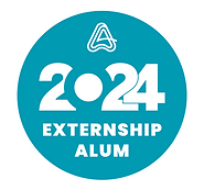
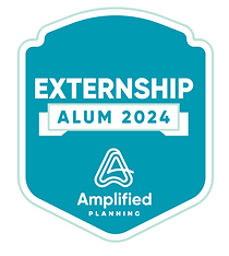
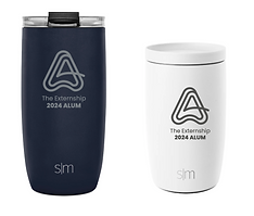
SWAG